
Fuel Brand Logos
Let's look at some fuel brand logos.
I’m both a fan and student of logo design. It’s what I did for much of my career and I am especially fond of fuel brands logos.
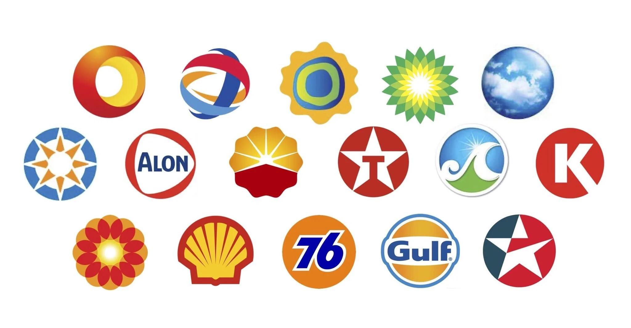
When you take a look at the recurring visual themes in the industry, it is easy to see a sea of circles. There are, of course, non-circles like Orlen and Valero and Mobil, so it’s interesting that the simple geometry of the circle appears so often. Let’s take a look to better understand why this may happen.
A logo can generally do three things.
The first is that a logo can reinforce your name. For example, Shell’s logo is a shell and Apple’s logo is an apple. Similarly, there are logos that are simply text-based which also put the focus squarely on a name, like Mobil. We often call that a wordmark.
The second is that a logo can show what you do. Think about the old Statoil logo which is essentially a drop of oil or the Century 21 logo, which is a house. Burger King’s logo is a burger.
The third thing that a logo can do is convey an idea. Think about Rolex, Budweiser, and Hallmark which are all crowns. This is the category with the most depth, because an idea can be about anything.
How each logo is designed though, is another story and when we look at this group, we see that these are highly geometric. This is to serve a few functional purposes. The first is as basic as to maximize space on a sign. Generally, fuel station main ID signs are tall and thin. So designing a long and wide logo doesn’t work as it would be way too small in the given space. The same goes for a tall and thin logo which would take up too much room on the sign. What fits perfectly at the top is a square, or yes, a circle.
This leads us to what I call “the half mile rule.” This rule says that if your logo can be seen a half mile away or more, then consumers will pass up a station in front of them to go to yours. That’s of course if you’ve built loyalty. They have to see it to know it’s there.
Most of the logos in the graphic above work extremely well for visibility. Often utilizing warm colors, they also stand out from the background of the blue sky. One of the best, most visible logo/signs ever is the old 76 dimensional sign. They weren’t just circles, but big red spheres in the sky, screaming out for all to see. Quite amazing.
I’m sure there are more circle logos out there in the fuel world. I’d love to see more if you have them. Full disclosure, I designed or had a hand in directing a few from the graphic shown, including Topaz, Copec, Terpel, and Aloha. I’d always include the “the half mile rule” in creative briefs.