
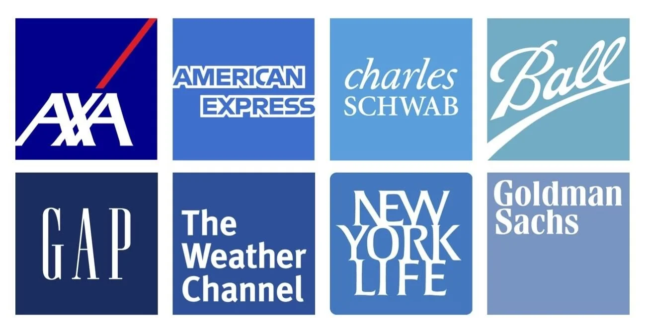
The Secret Power of the Blue Square
There are logos that you donʼt need to love. You don’t need to wonder what they are or what they represent. They simply live within the visual landscape confidently and proudly displaying their company’s name.
I first wrote about “The Secret Power of the Blue Square” almost 20 years ago on the design blog, Speak Up. There we debated the purpose of this design approach and the skill needed to craft one. Interestingly, I think there may actually be a few more high profile companies that have embraced the blue square since then. Maybe unstable times require a stable visual identity.
The blue square combines simple geometry with a calming, confident, and corporate color. The blue square focuses attention on perhaps the most important part of the brand identity, the name. The blue square is efficient and stacks up well on step and repeat banners. The blue square is also incredibly easy to use. It has built-in background control, meaning you can put it on any image or campaign and not have it interfere with the legibility.
As long as the type is well-designed, why not a blue square?